Documentation
guide
Airbnb Clone: Component Architecture Guide
Welcome to the Airbnb UK homepage clone. This guide walks you through what we built, how it all fits together, and why the architecture matters. If you've never worked with a component-based frontend before, don't worry — this guide is written with you in mind.
What Is This Project?
This is a pixel-perfect recreation of the Airbnb UK homepage (airbnb.co.uk), built entirely from scratch using modern web technologies. The frontend is React with TypeScript, the backend is Go with GraphQL, and the whole thing is tested with automated screenshot comparisons.
But the real story isn't just "we cloned a website." The real story is how we built it — using a component architecture that makes the entire UI modular, testable, and swappable. Every button, every card, every section of the page is its own self-contained piece. You can rearrange them, restyle them, or drop them into a completely different project.
The Component System: Atomic Design
We use a pattern called Atomic Design, which organises UI components into five layers. Think of it like chemistry: you start with the smallest possible pieces, and you combine them into increasingly complex structures.
Atoms (27 components)
These are the smallest building blocks — things that can't be broken down any further. A logo, a badge, a single icon, a star rating. On their own they don't do much, but everything else is built from them.

The logo above is a single atom. It's just an SVG icon and a wordmark, styled with CSS. But because it's isolated as its own component, we can change the brand colour in one place and it updates everywhere — the header, the footer, any page that uses it.

Same idea with badges. This "Guest favourite" badge appears on listing cards, but it's defined once and reused wherever it's needed.
Molecules (17 components)
Molecules are small groups of atoms working together. A search bar is a molecule — it combines an input field, some icons, and a button into something that feels like a single interactive element.

The search bar above combines several atoms (icons, text, a button) into a cohesive unit. It handles its own layout and spacing internally, so wherever you place it on the page, it just works.

Navigation tabs are another molecule. Each tab is essentially an atom (a clickable label), but the molecule handles the switching behaviour and the active state indicator.
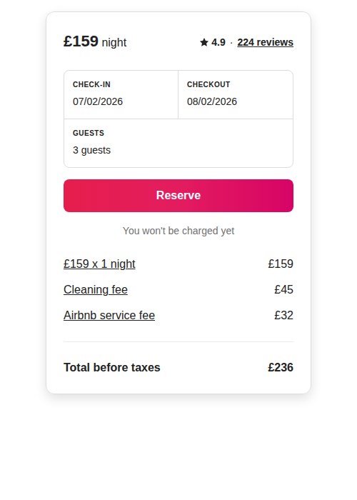
The booking card is one of the more complex molecules. It brings together price displays, date selectors, guest counters, and a reserve button into a single reusable widget. The component handles all the internal layout, but the data it displays comes from props passed in by its parent.
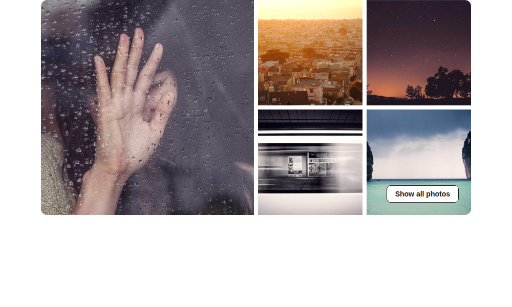
The photo grid arranges images in an asymmetric layout — one large hero image on the left, four smaller ones on the right. This pattern appears on room detail pages and is reusable anywhere you need a gallery-style layout.
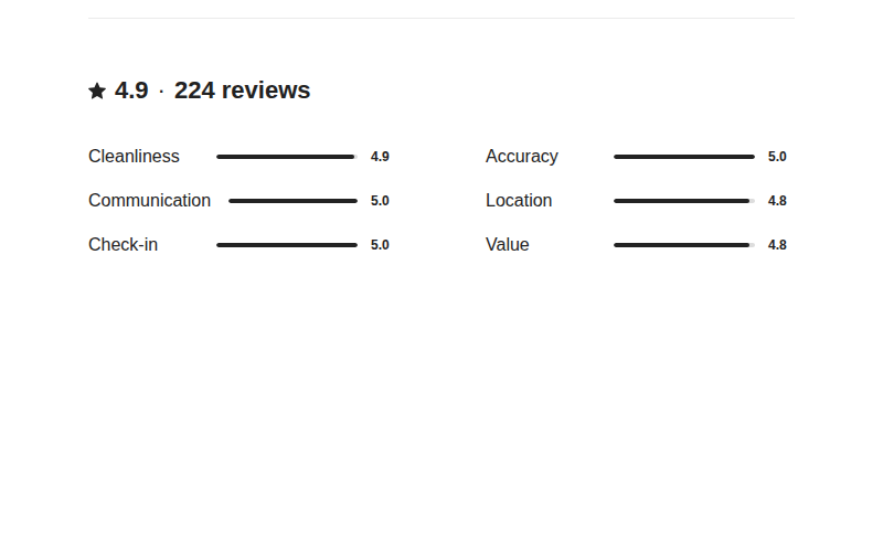
The review summary molecule combines a star rating, review count, and category breakdowns into a compact overview. It's designed to give users a quick snapshot before they dive into individual reviews.

The user menu is a compact molecule that sits in the header. It combines a hamburger icon and a user avatar into a dropdown trigger.
Organisms (14 components)
Organisms are larger sections of the page — things like the header, the footer, or an entire search section. They're built by composing molecules and atoms together.

The header organism combines the logo atom, navigation tabs molecule, search bar molecule, and user menu molecule into the full top bar you see on every page. Each piece is independent, but the organism defines how they sit together.

The search section is the prominent area below the header where users type their search. It wraps the search bar molecule in a styled container with background colours and spacing.
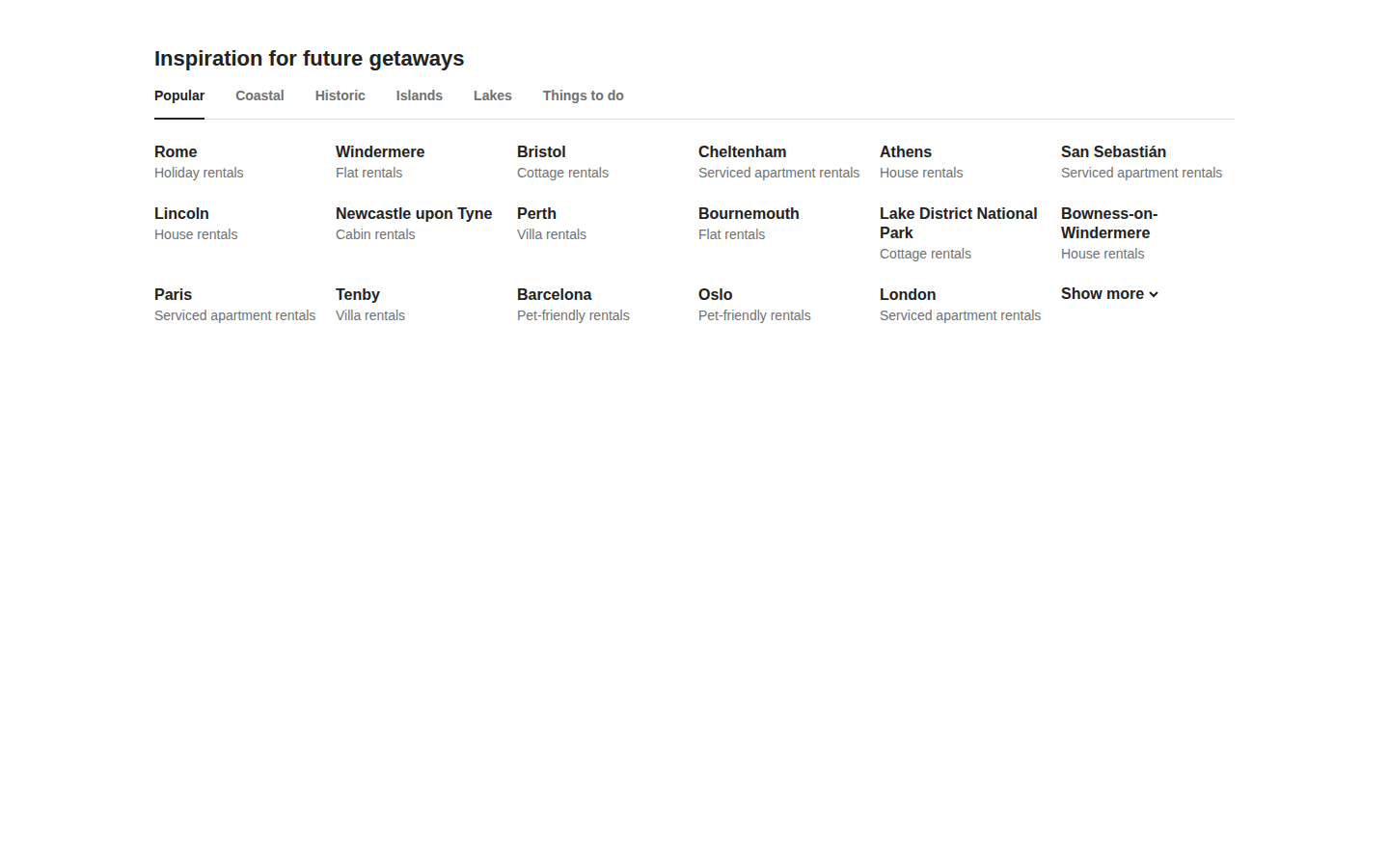
This organism powers the "Inspiration for future getaways" section. It combines tab navigation with a grid of destination cards, and the data comes from the GraphQL backend — the component just renders whatever it receives.
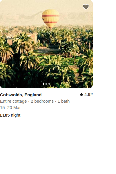
The listing card organism wraps an image carousel, location text, pricing, and a rating badge into a single card. On the homepage, you'd see a grid of these. Each card is the same component, just rendered with different data.
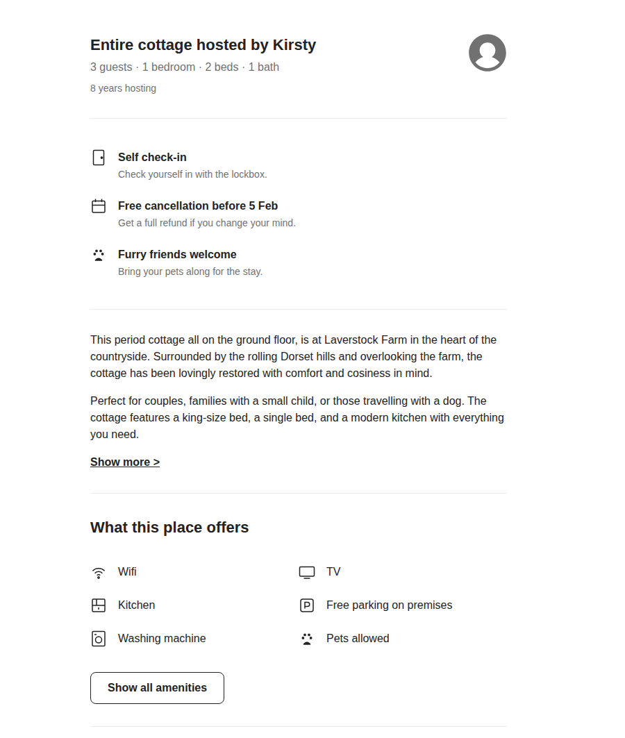
The listing info organism appears on room detail pages. It shows the property title, host information, key features, and amenities — all composed from smaller atoms and molecules.
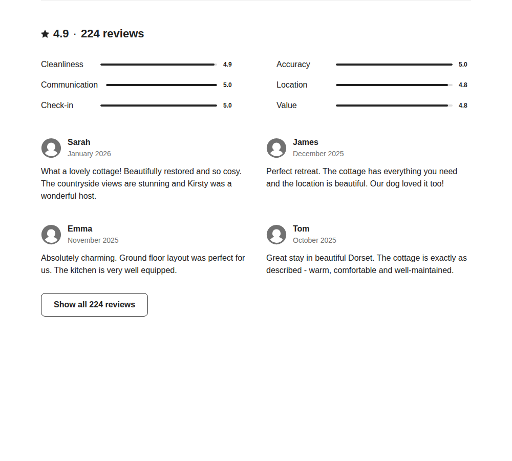
The reviews section organism combines the review summary molecule with individual review cards, laid out in a grid. It handles pagination and the overall section layout.
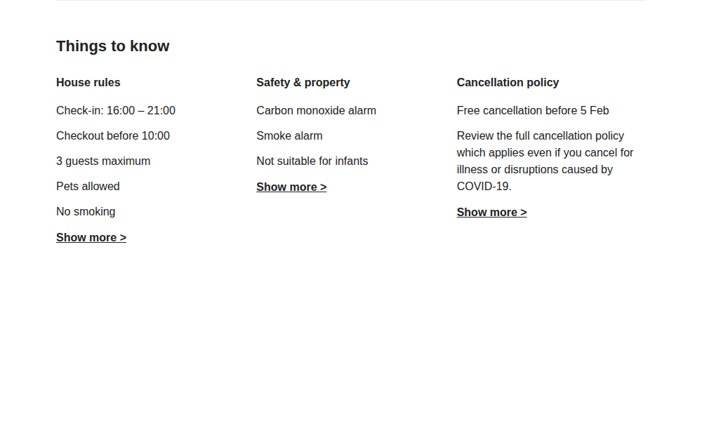
This organism presents house rules, safety information, and cancellation policies in a three-column layout. Each column is built from the same underlying atoms but populated with different content.
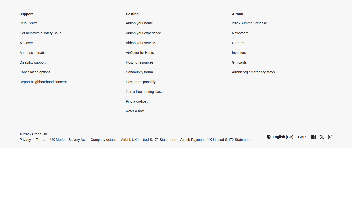
The footer is a large organism with multiple columns of links, organised by category (Support, Hosting, Airbnb), plus legal text and language/currency selectors at the bottom.
Templates (2 components)
Templates define the overall page layout — where the header goes, where the main content area lives, where the footer sits. They don't contain any real content themselves; they just provide the structure that organisms slot into.
We have two templates: HomeTemplate for the homepage layout, and RoomTemplate for property detail pages.
Pages (3 components)
Pages are the final layer. They wire up data fetching (GraphQL queries via Apollo Client) and pass real data down through templates, into organisms, into molecules, into atoms. A page component is the glue between your backend data and your visual components.
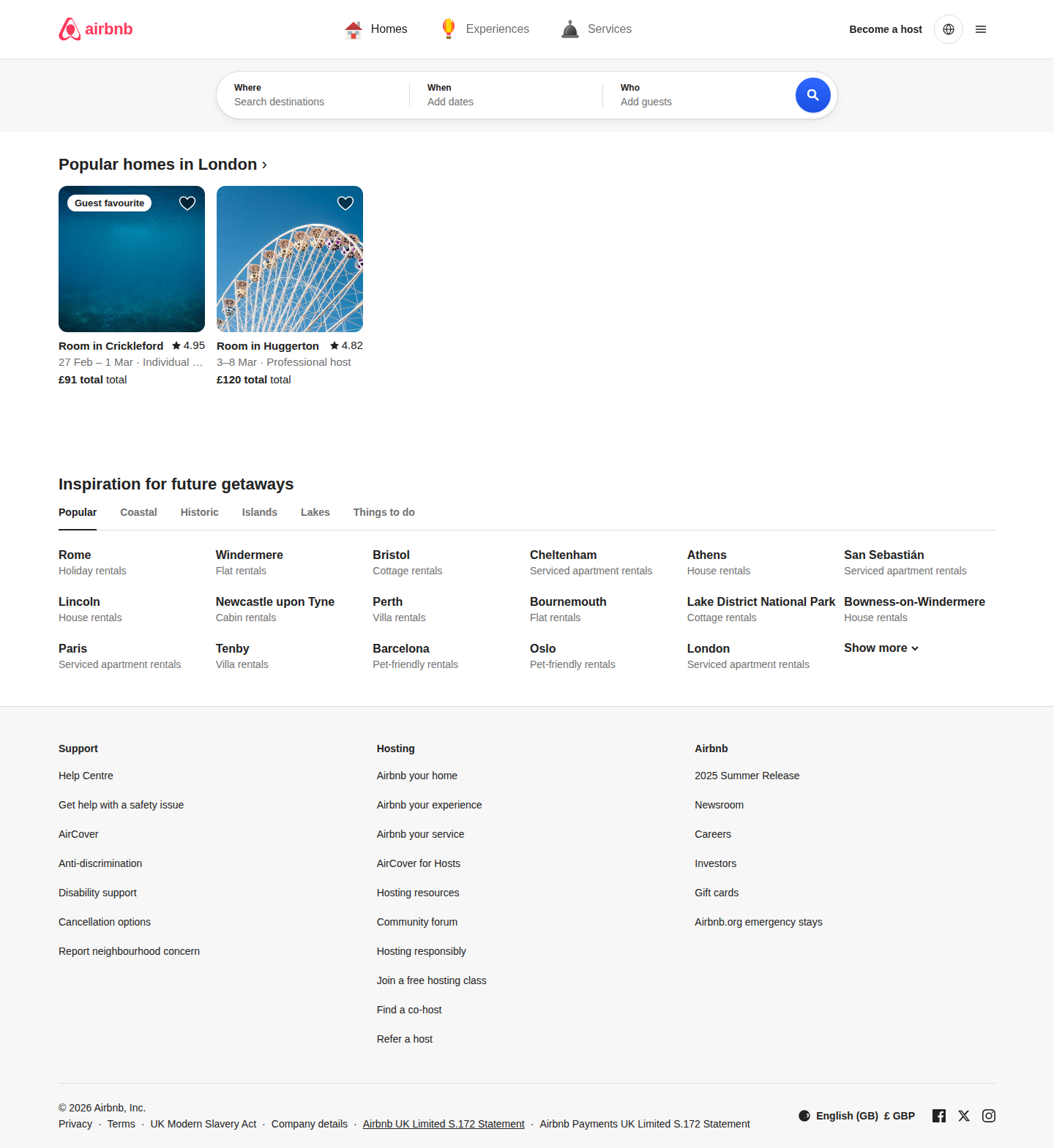
The homepage above is assembled entirely from the components described in this guide. The header organism at the top, the search section, the inspiration grid, and the footer — all composed together through a template.
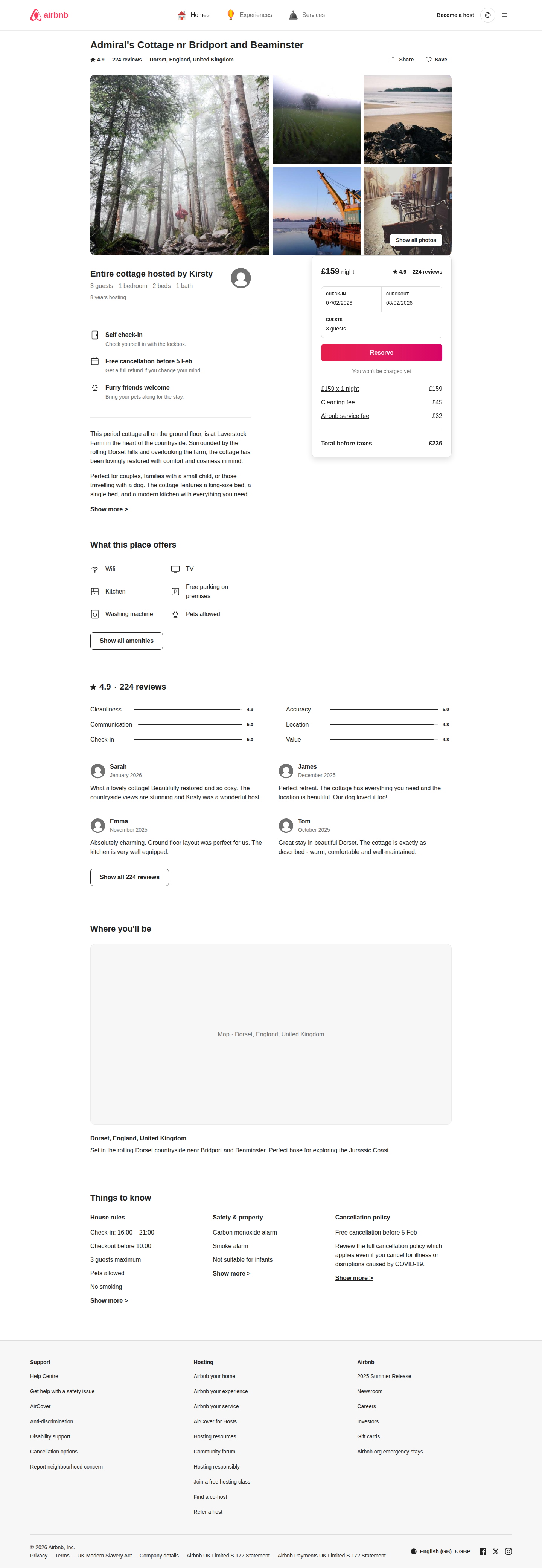
The room detail page uses the same header and footer organisms, but swaps in different organisms for the main content: a photo grid, listing info, booking card, reviews section, and things-to-know.
The Full Picture
Here's how the actual homepage looks when everything comes together:
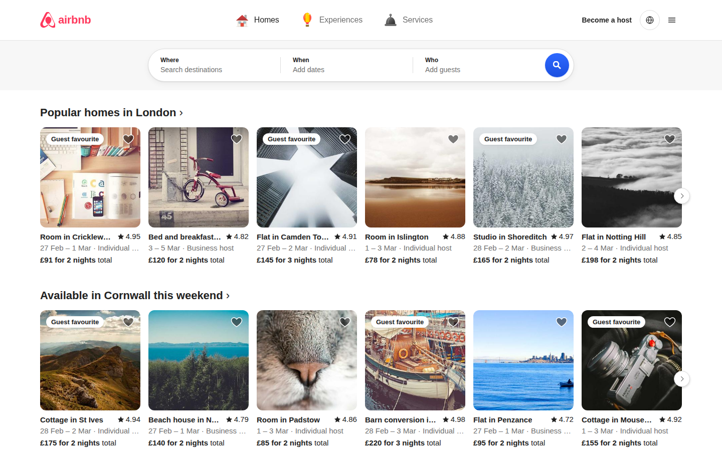
And here's the full-page version showing everything from top to bottom:
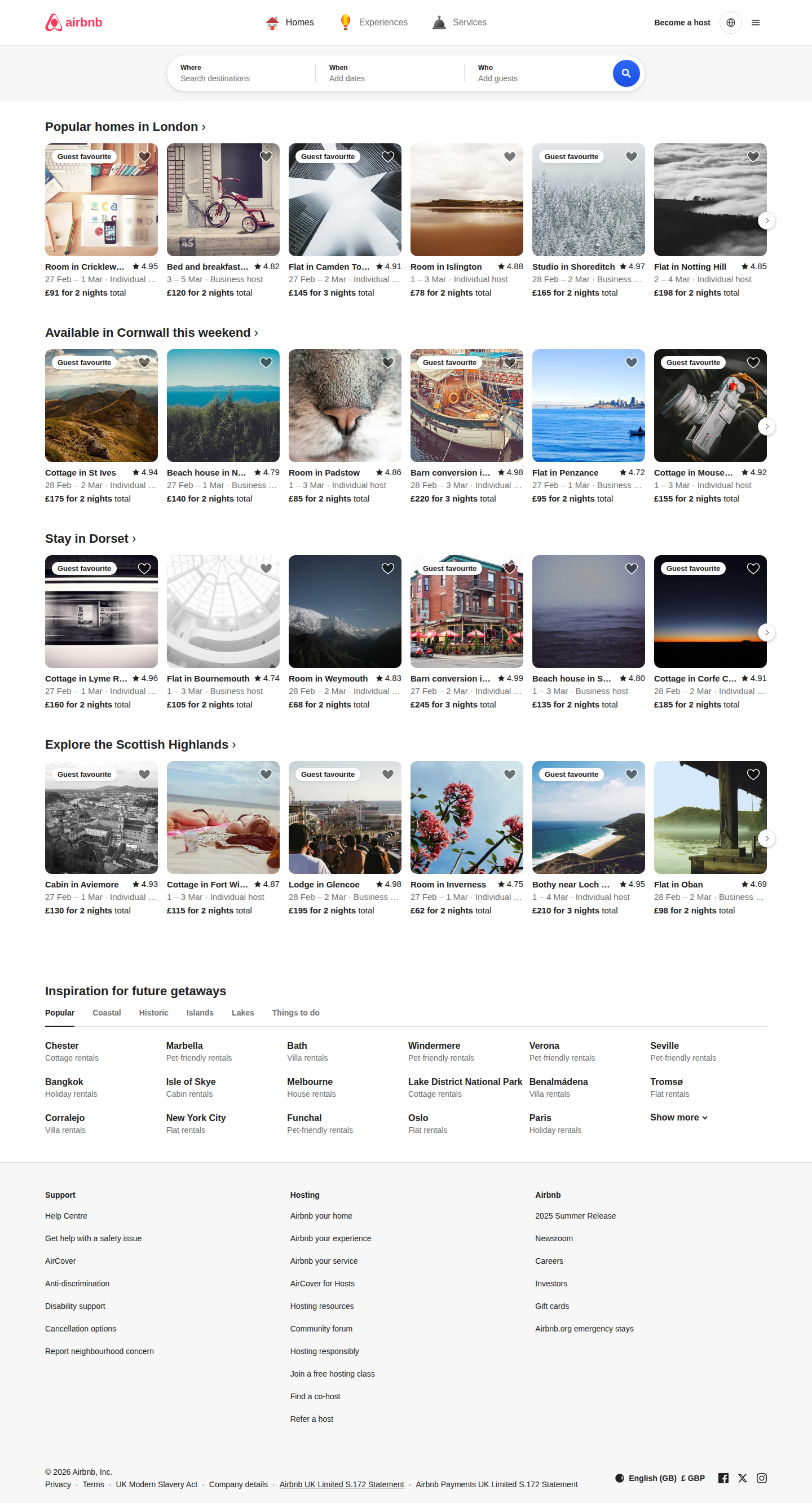
Every pixel you see on that page is rendered by one of the 63 components in our library. Nothing is hardcoded in the page itself — it's all composition.
Why This Matters
Everything is isolated and testable
Each of the 63 components has its own file, its own CSS module (so styles never leak between components), and its own Storybook story (so you can view and interact with it in isolation). We have 79 automated tests that verify component behaviour without needing a running server.
Reskinning is trivial
Because all visual styling flows through CSS custom properties (design tokens), you can completely change the look of the entire application by editing a single file: frontend/src/styles/variables.css. Change the brand colour from Airbnb red to blue, adjust the border radius, swap the font — and every single component updates automatically. The TypeScript interfaces don't change. The tests still pass. The data layer is untouched.
This means you could take this same component library and create a completely different brand identity in an afternoon, without touching a single line of component logic.
Storybook lets you see everything
Every component has a Storybook story, which means you can browse the entire component library in your browser at http://localhost:6006. You can see each component in isolation, inspect its props, and understand how it works before you use it. This is invaluable for designers reviewing implementations, for new developers learning the codebase, and for QA teams checking visual consistency.
The data layer is completely separate
Components don't fetch their own data — they receive it through props. The GraphQL queries live in the page components, and data flows downward through the component tree. This means you can swap out the backend entirely (switch from GraphQL to REST, or from Go to Node) without changing a single component.
How to Run It
You need three things running to see everything:
The backend serves the GraphQL API that provides destination data, listings, and reviews:
cd backend && go run ./cmd/server
# Now running on http://localhost:8080
The frontend is the React application that renders the actual pages:
cd frontend && npm install && npm run dev
# Now running on http://localhost:5173
Storybook lets you browse every component in isolation:
cd frontend && npm run storybook
# Now running on http://localhost:6006
Once all three are running, open http://localhost:5173 to see the full application, or http://localhost:6006 to explore the component library.
Project Structure
frontend/
  src/
    components/
      atoms/          27 components (Logo, Badge, StarRating, Icons...)
      molecules/      17 components (SearchBar, BookingCard, NavTabs...)
      organisms/      14 components (Header, Footer, ListingCard...)
      templates/       2 components (HomeTemplate, RoomTemplate)
      pages/           3 components (HomePage, RoomDetailPage, MockPage)
    styles/
      variables.css   Design tokens (colours, spacing, shadows, radii)
      global.css      Base reset and typography
  .storybook/         Storybook configuration

backend/
  cmd/server/         Entry point
  internal/
    domain/           Business entities
    ports/            Interface definitions
    application/      Use cases
    adapters/         GraphQL resolvers, in-memory repos

e2e/
  capture-comparison.ts   Automated screenshot capture script
Capturing Screenshots
The screenshots in this guide were captured automatically using a Playwright script. If you want to regenerate them (for example, after making visual changes), make sure all three servers are running and then:
cd e2e && npx tsx capture-comparison.ts
This captures 20 screenshots covering the full homepage plus individual components from Storybook, and saves them to docs/screenshots/.
Key Takeaways
This project demonstrates that a production-quality UI like Airbnb's can be decomposed into a library of 63 independent, composable components. Each component is isolated, tested, and documented in Storybook. The visual design is controlled entirely through CSS design tokens, making the whole system reskinnable without touching component logic. And because the data layer is separated from the presentation layer, the same component library could power completely different applications.
The architecture isn't just academic — it's how modern frontend teams ship at scale. Small, focused components that compose into complex UIs, with automated testing at every level.